
I started using Cowork (Anthropic’s Claude-based desktop tool) with a different project in mind. I wanted to see how much I could automate across a service-based business I run. The answer came fairly quickly: there is value there, but the ceiling is lower than I hoped. A services business runs on relationships and judgment, and those do not compress well.
Then I turned to Design a Lot.
DAL is my digital product store: fonts, mockups, graphics, templates. Everything made by me, sold to logo and brand designers. And the moment I started working on it with Claude, the ratio flipped. There was an enormous amount to do and, it turned out, an enormous amount we could actually do together.
This is a log of the first ten days.
What I already knew going in
Design a Lot had the same problem that most solo product businesses have: the product was in good shape, the everything-else was not. The copy hadn’t been touched in a while. Pricing logic existed in my head but not on paper. The email list was healthy but underused. The growth plan was a permanent mental tab that never fully loaded.
I also knew there would be a ceiling somewhere. I had a suspicion it would be design. Not strategy, not code, not copy – the actual visual work, where taste and craft and iteration with your own eye are the whole job. That suspicion turned out to be correct, and I’ll come back to it.
The brand foundation: starting from scratch, properly
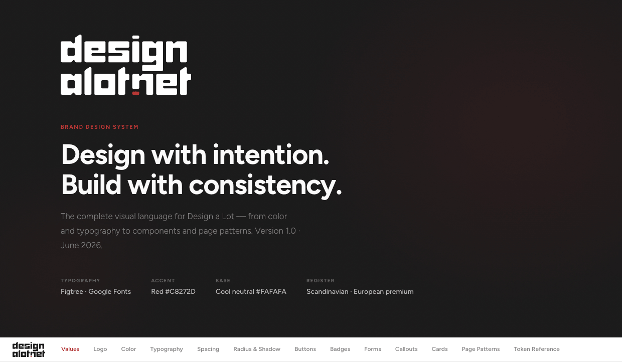
The first thing we built was documentation: brand positioning, voice guidelines, a full design system (colors, type, spacing, components), content pillars, the tech stack, and a canonical product catalogue with agreed pricing.
The process mattered here. We went back through all the existing content on DAL – the product pages, the blog, the emails – and used it to extract and codify the actual brand voice, not an invented one. Then we built the design system through rounds of brainstorming and iteration, testing decisions against real DAL pages until we arrived at something that felt right and could be used as a reference going forward.
That foundation became the basis for everything else. Every piece of copy, every HTML output, every plan was built on top of it. Without it, the work further down the list would have been inconsistent.
Pricing: a proper strategy, not just numbers
Pricing across a digital product catalogue is one of those things that looks simple and isn’t. You have multiple product types (fonts, mockups, templates), multiple tiers within some of them (single weights vs. full families, individual mockups vs. packs), multiple license types (desktop, web, app), and multiple distribution channels with different price points.
We worked through the full pricing logic for all of it: entry-level fonts, the Cabo family, Brandogram (complete vs. single weight, own store vs. marketplaces), mockups, graphics, and templates. The goal was a pricing structure that was coherent across the catalogue and easy to explain to a customer. What came out was a documented pricing system that now lives in the brand files – canonical, referenced in every copy session, no longer something I have to reconstruct from memory.
Growth plans and audits: fast, structured, and interactive
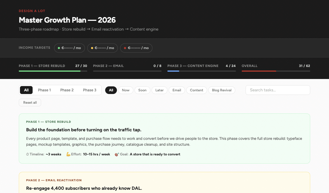
This is the area where the volume surprised me most.
A master growth plan for the store. A Brandogram visibility plan. An SEO and LLM discoverability audit (including where the store appears in AI-generated answers, which is increasingly worth paying attention to). An email marketing strategy. An evergreen content plan. A paid advertising brief. An audit tracker with live progress checkboxes.
Each of these, done properly alone, would take me the better part of an afternoon. Most happened in a single focused session. What made them useful was not just the speed but the format: every major plan came out as an interactive HTML file, styled to the DAL design system, with a structured NOW/SOON/LATER priority framework. They are not documents that sit in a folder and get forgotten. They are reference tools.
The HTML audit format worked well enough that we turned it into a dedicated skill – a reusable template that follows the design system and brand voice, ready to use for any future audit or plan.
Product copy: over 100 products, rewritten in under 10 minutes
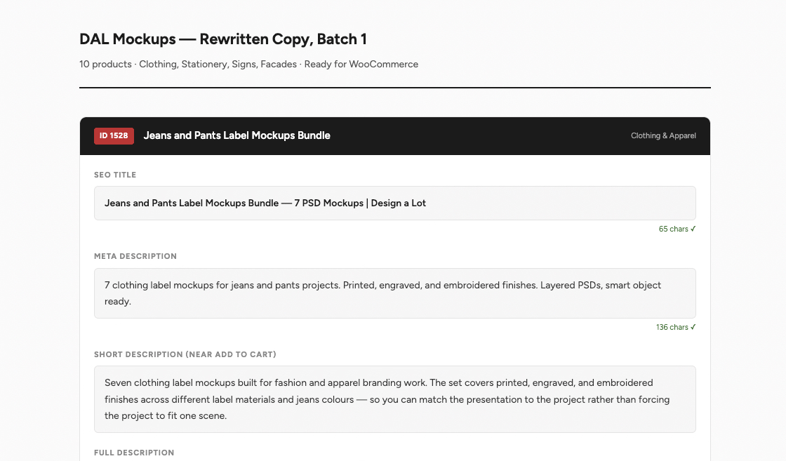
This is the one I keep coming back to when I describe what changed.
The full product catalogue: mockups (five batches), graphics, templates, fonts. Plus a pass over every product’s SEO title and meta description. The copy for each product was rewritten following the brand voice, using the actual product details already on each page, with SEO intent built in. Over 100 products.
Alone, this is roughly two weeks of work. More, realistically, because it is exactly the kind of task that is hard to stay motivated through. In practice, it took under 10 minutes per batch.
The key was the brand foundation work done first. Because the voice, the rules, and the product details were already documented, every copy session could reference them directly. The output felt coherent because it was pulling from a coherent system.
Page proposals: iteration into a system
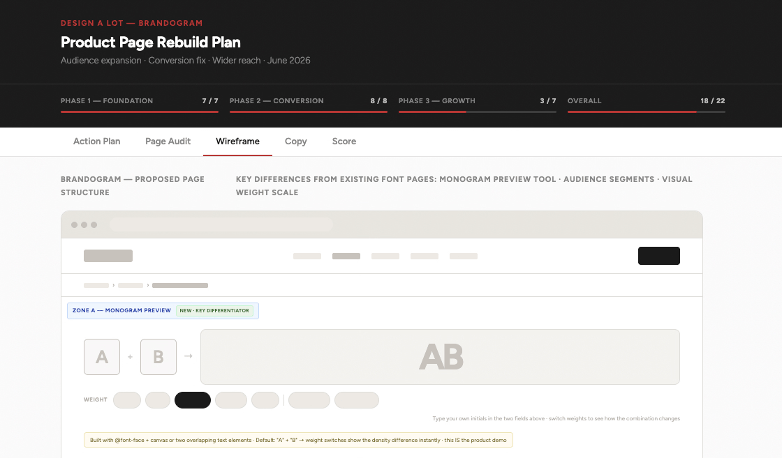
Full rebuild proposals for four product pages: Cabo Soft, Brandogram, the Never-Ending Bundle, and the mockup category. Each one with a list of numbered issues, a proposed UX structure, and a wireframe built to the DAL design system.
Early on, these took several rounds of back-and-forth to get right. By the time we had done two or three, we had a format that worked consistently, and we turned it into a skill. Now a page proposal session starts from a proven template rather than from scratch. The output is an interactive HTML document, styled, and ready to use as a brief for the actual rebuild.
Three WordPress plugins: the thing that impressed me most
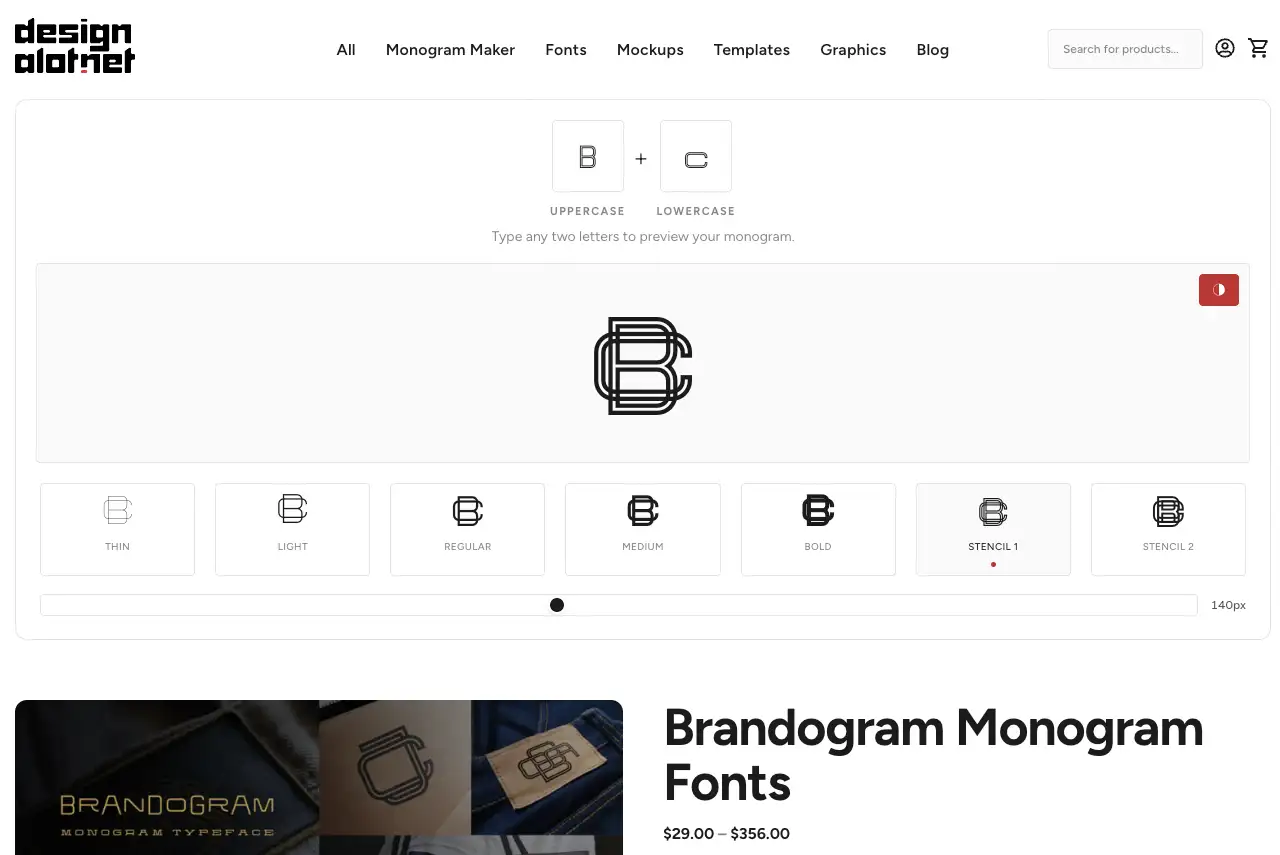
Since launching Brandogram, I had wanted to build a free tool that lets people test the font before buying. The idea was clear; finding the time and the skill set to build it properly was the problem.
In ten days, we built three plugins. All of them installable, all of them integrated with Elementor, all of them production-ready.
The first was the dal-type-tester: a general font testing tool for the whole catalogue. We went through several versions, iterating on the UX and the technical edge cases, until it worked cleanly. Then we turned that into a skill, so future plugin builds start from a solid, proven scaffold.
The second was the Brandogram Tester: an Elementor widget specifically for Brandogram. It includes a file browser for loading font files directly into the tool, unique font-family-per-instance to prevent rendering conflicts when multiple widgets appear on the same page, and a fix for the Elementor editor preview – a notoriously tricky integration to get right.
The third was the Monogram Maker: a public-facing tool where anyone can enter initials and preview monogram combinations using Brandogram. The standout feature is the PNG export – visitors can download their generated monogram directly. There is also an optional MailerLite subscribe step, but the download is not behind it. The tool is free to use without giving anything in return.
All three have proper security throughout: nonce verification, output escaping, capability checks, clean uninstall routines. Not demos – real plugins.
The content pipeline: agents running every morning
This one is different in character from everything else on this list because it is not a file or a document. It is a system that runs without me.
We built a semi-automated content pipeline using Claude Code, with scheduled agents that run every morning. The flow works like this: a Writer Agent pulls the oldest pending item from a Content Queue in Notion, reads the brief and the Style and Instructions guide, and drafts the post. An Editor Agent then reviews it against the same style guide. If there are issues, the writer revises – up to three loops. Once the draft is clean, it lands in a “Awaiting Your Review” status in Notion, where I read it, leave notes, and approve or reject.
On approval, an SEO check runs automatically: title length, meta description, keyword presence, heading structure, word count, internal link count. Pass threshold is 6 out of 7. If it passes, the post gets pushed to WordPress as a draft via the REST API, with Yoast meta fields populated. I publish manually.
The Style and Instructions document is a living file. Every approval or correction I leave gets appended to it, so the agents improve over time based on my actual decisions.
The pipeline is new and still being tested. But the architecture is solid, and the idea of waking up to a blog post draft waiting for my review – rather than a blank page waiting for my energy – is already changing how I think about content.
WooCommerce scripts: automation where it actually saves time
A set of Python scripts for the WooCommerce REST API: bulk product content updates, pricing changes, an SEO field checker, a mockup bulk-creation script that generates WooCommerce products from an asset list, and utilities for managing bundle links and download files. All credential-safe, credentials via environment variables only.
These exist because manual WooCommerce work at scale is tedious and error-prone. The scripts run it in minutes.
Content: honest about what worked and what did not
Two complete blog posts (a brand identity design systems case study, a wedding monogram design guide), a draft in progress, and rewrites of two existing articles that had gone stale.
Email: a Phase 2 email strategy document, a five-email win-back sequence with a styled HTML preview, and several individual emails. Not much deployed yet – that is the next stage.
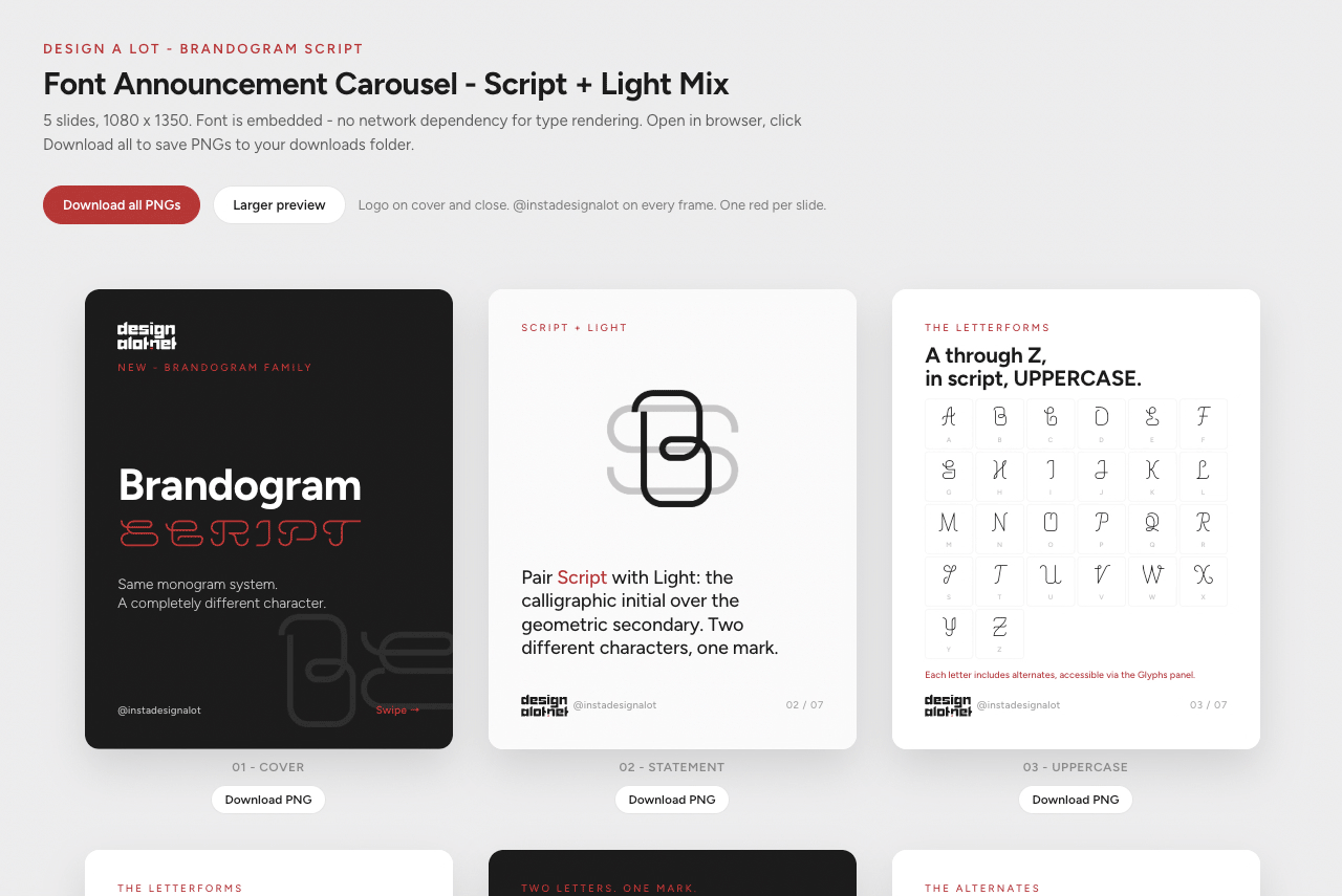
Social content is where I have to be direct: results were mixed. The Instagram carousel for the Brandogram Script launch came out ok to good after several rounds of iteration, plus some manual edits I did myself to tighten the visual result. The other attempts – font identification carousels, Pinterest graphics – did not land at the standard I hold the brand to. The carousel skill we built is a decent foundation, but this part of the workflow has more distance to travel.
Where it genuinely does not work yet: design
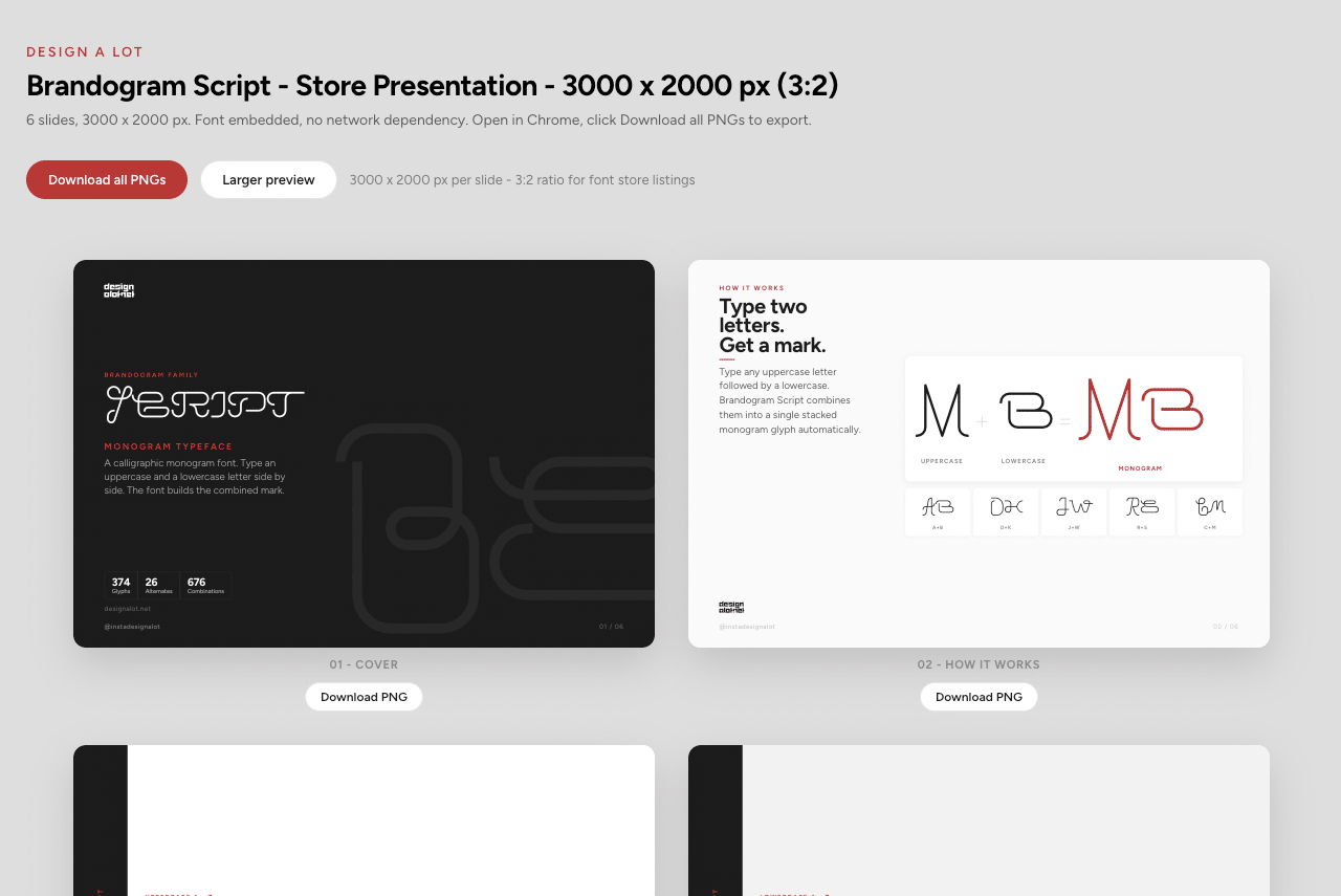
Creative and visual work is where Claude runs into its real limits with me. Not for lack of trying – we went through many iterations on the social content, and some of it reached an acceptable level. But acceptable is not the bar for published work under my name.
The font design, the mockup work, the visual identity of the store: those required my eye and my hand throughout. I think there is a path forward on the visual side too, but it is not going to come from asking Claude to design freely. It will come from building very specific templates and systems – constrained enough that the creative decisions are already made, and Claude is executing against them. The carousel skill is a step in that direction. The type tester plugin, where the design was mine and the code was Claude’s, is a better model.
On technical work, on the other hand: no reservations whatsoever.
What changes
The overhead of running a solo product business is real: copy, strategy, automation, the content pipeline, the documentation. That work used to compete directly with the actual product work for my time, and it usually lost.
It does not have to work that way anymore. The surrounding work moves faster, leaves more room for the work that only I can do, and builds up into systems that make the next sprint faster than this one. The content pipeline running every morning while I focus on making things is, for me, the clearest expression of what that looks like in practice.
That is the honest version of what ten days looked like.
Design a Lot is my store for fonts, mockups, and design templates at designalot.net. If you work in logo design or brand identity, most of what’s here was made for you.
